The challenge of designing a dashboard is organizing a large amount of data into a single screen that is visually stunning and highly functional. Touch points need to be obvious and navigation needs to be logical. Each piece of information has to vie for the attention of the user without distracting from the neighboring content. Related elements need to share a common visual language while more distant elements need to create separation without violating consistency and cohesion.
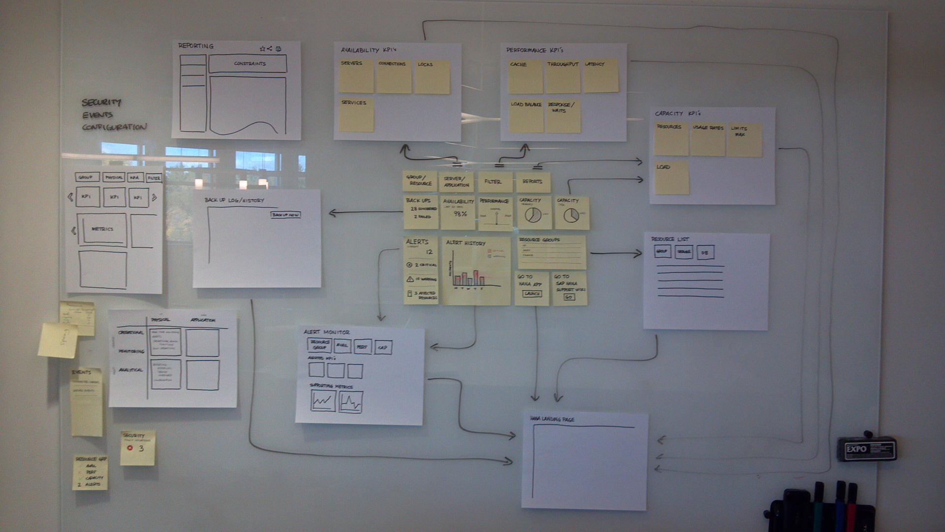
The dashboard is for a multi-level monitoring system. The picture below was an attempt to fit all the enterprise level pieces together visually and study the workflow down to the lower level pages. I was able to organize all the pieces into a dashboard that allowed the user to easily drill up/down and cross-navigate.
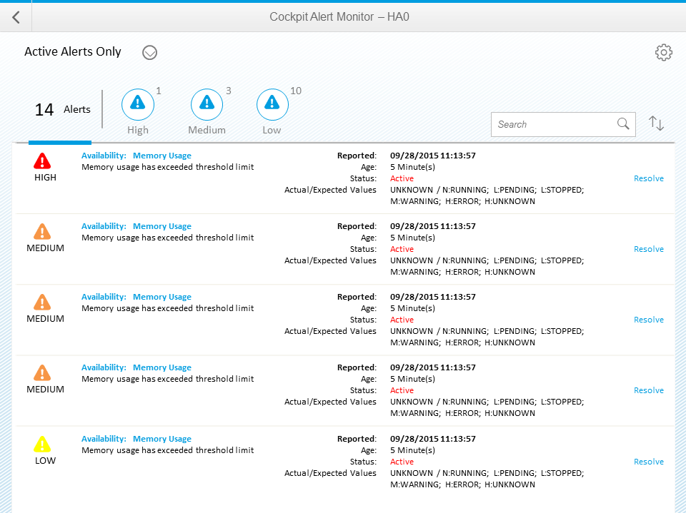
Over the years, there have been several redesigns but the foundation of the design and navigation remains. The current iteration of the SAP HANA Cockpit is shown below.

Landscape launchpad

System Overview
The dashboard is responsive and can be viewed with phones and tablets.

iPad